I'VE RECENTLY made visits to the Borough of Sutton in south London, where the Liberal Democrat Party have just won a by-election. The most obvious difference with Haringey is the state of the streets: Sutton's are noticeably cleaner!
However, one difference between the Boroughs can be compared from anywhere in the world: and that is the home pages of the Councils' respective websites. For ease of comparison, I've put them side-by-side and same-size:
Haringey
Sutton
(click to enlarge: un-retouched screen-shot from 30" screen)
Haringey's home page appears bitty and cluttered. Our council tries to force everything into the first view, whereas the Liberal Democrat Council's home page is scrollable. I suggest the services are better laid out in the latter. Sutton's first view also focuses better on the resident-user who wants to report a problem and to get it fixed.
A Borough's home-page is it's face to the world.
Couldn't we do as well as Sutton?
If not, at least better than our present effort?
______________________________
Council home page: Haringey
Council home page: Sutton
_______________________
Councillor and
Liberal Democrat
__________________________________________________________________________________
P.S. Update above to reflect changes 2015-09-21 to Haringey's website (screenshots captured within seconds of each other—click to enlarge).
Tags for Forum Posts: Council, Haringey, Sutton, home page, web page
Replies to This Discussion
-
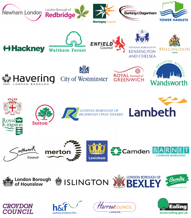
At least there's some consistency, because they've also go the ugliest borough logo:

-
I quote fancy those Royal ones, how to we get to be Royal? Is it automatic now we have our collective OBE?
-
Sorry Pam, I think you have to have a royal residence in the borough - one day eh?
-
Could we get one of those cheap Dutch ones to move in? They will have 20000 new homes to choose from. Or they could blag a flat in Bruce Castle, that was a royal residence not very long ago.
-
A kind of Primark royal? I like the idea.
-
How about 'Right Royal Haringey'? That's got a certain ring to it.
-
I there should be a competition for the worst "Welcome to..." signs that some borough insist on having on roads crossing their borders. The worst I ever saw was "Hillingdon- the adventure begins"
-
That was probably when they still had the ski slope.
-
I thought it was - " Haringey - you're welcome to it " ?
-
Mark, I'm not going to argue with you ;-)
-
Hammersmith & Fulham's new one is the worst.
But I'm sure it won't be long before the Haringey Cabinet wastes some money on a brand consultancy's poorly cobbled together 'vision'. It's not like these are times when they're having to cut services, or anything like that.
-
James, we can probably write the vision here.
"Haringey Council. We do things that people need, when they need them and don't charge too much"
OK, what's the going rate for a consultant's fee?
- ‹ Previous
- 1
- 2
- 3
- 4
- Next ›
© 2026 Created by Hugh.
Powered by
![]()